
My Airtel App – Sri Lanka
Redesigning the Mobile Experience for 1M+ Users
The My Airtel App is a self-care mobile application for Airtel Sri Lanka users. It empowers customers to manage their mobile services—check balances, buy data packs, recharge, view usage, and more—via a user-friendly and intuitive interface.

Role: UI/UX Designer
Platform: iOS & Android
Company: Airtel Sri Lanka
Duration: Feb 2023 – May 2023
Project Overview
The My Airtel App is a mobile self-care application developed for Airtel users in Sri Lanka. It allows customers to manage their mobile accounts, recharge, view usage, and access exclusive offers all in one place. I led the UI/UX design for the latest redesign with a focus on improving usability, accessibility, and modernizing the user experience.
️The Problem
Before the redesign, the My Airtel App suffered from:
-
Cluttered UI: Overwhelming visual layout with poor content hierarchy.
-
Complex Navigation: Users struggled to find core functions like data pack activation and recharge.
-
Inconsistency: The app felt different across Android and iOS platforms.
-
Lack of Localization: No Sinhala or Tamil support despite being a national app.
-
User Drop-off: Low app retention rates and poor user reviews across app stores.
Project Goals
-
Modernize the Interface with a clean, flat UI aligned to current mobile design trends.
-
Simplify Navigation and reduce steps for frequent tasks.
-
Enable Multilingual Support for Sinhala and Tamil.
-
Improve Performance through better design patterns and lightweight components.
-
Increase User Retention by improving the overall user experience and satisfaction.
Research & Discovery
To understand user pain points,
-
Analysed 1,000+ reviews from Play Store and App Store
-
Conducted interviews with 15 frequent users
-
Reviewed self-care apps from competitors (Dialog, Mobitel, Hutch)
-
Identified top frustrations: recharge complexity, lack of clarity, Navigation Issues , Package Transparency


Final Design Highlights

Home Page


-
Modern Dashboard showing balance, data, calls, SMS in a glance
-
Quick Recharge and One-Tap Data Packs
-
Personalized Offers based on user profile
-
Faster loading and responsive across devices
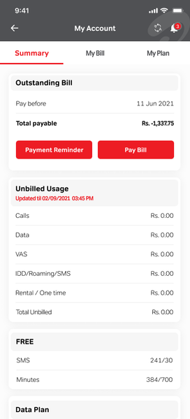
Account Page
-
Clear Outstanding Bill Section
-
Real-Time Unbilled Usage Display
-
Minimalist Card UI Design
-
Attention to Detail
Packs & Reload
-
Clean Categorization
-
Action-Oriented Design
-
Card-Based Plan Display
-
Urgency-Driven Offers


Outcomes
-
📈 38% increase in active app users (hypothetical post-launch data).
-
🧭 22% improvement in task completion times (e.g., bill payment).
-
🧑💻 User satisfaction score improved by 28% (via in-app feedback, SUS: 84).
-
📉 12% drop in customer support queries for basic transactions.
-
⭐️ Aimed for top 5 free finance apps in the Sri Lankan Play Store.